Building your First Custom Dashboard View
Last updated: October 13, 2026
Custom Dashboard is a tab where you build your own layout from rows, cells and widgets, so one screen shows exactly the metrics you report on. This article covers building and saving your first view.
Before You Start
Custom Dashboard is available on selected plans. See rankscale.ai/pricing for details. If you do not see it in the sidebar, your plan does not include it.
You will find it under Insights in the sidebar, at Brands > [Brand Name] > Custom Dashboard. It opens on a starter layout of four widgets, which you can change, clear or build on.
How a View is Built
Three pieces make up every view:
A row is a horizontal section. Each row holds one to four cells.
A cell is one tile inside a row.
A widget is the content inside a cell: a metric card, a chart, a table, or a text block.
You choose the widget per cell, so two cells in the same row can show different things.
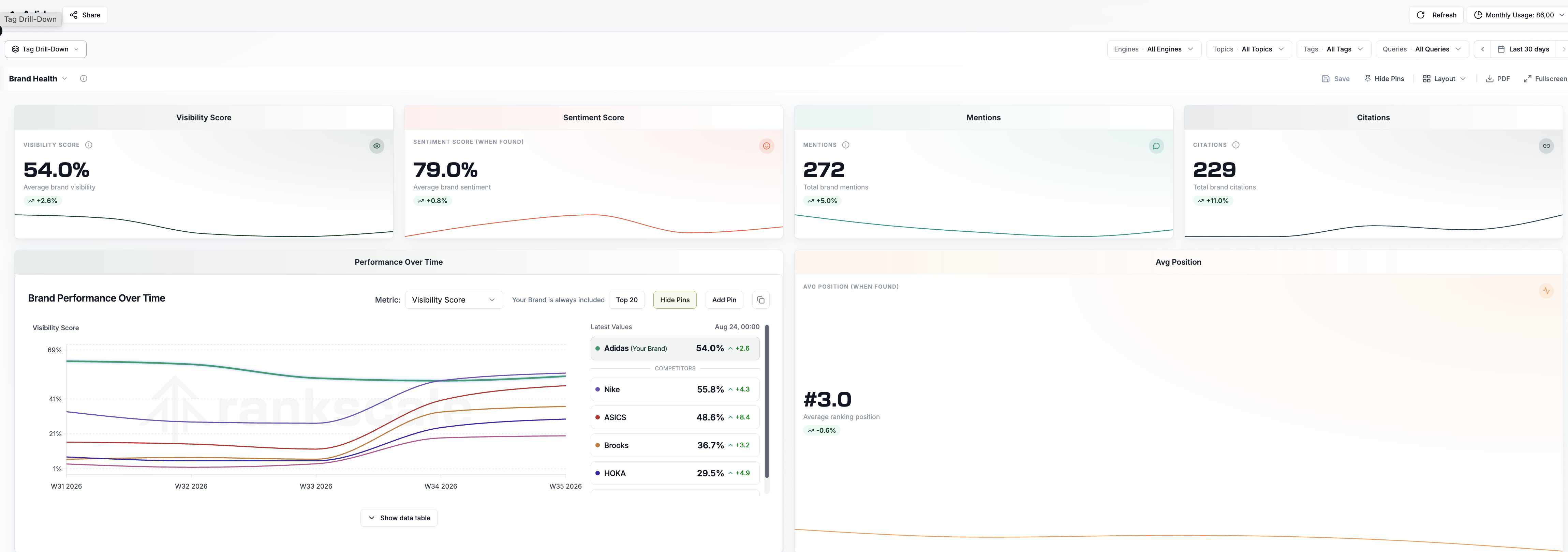
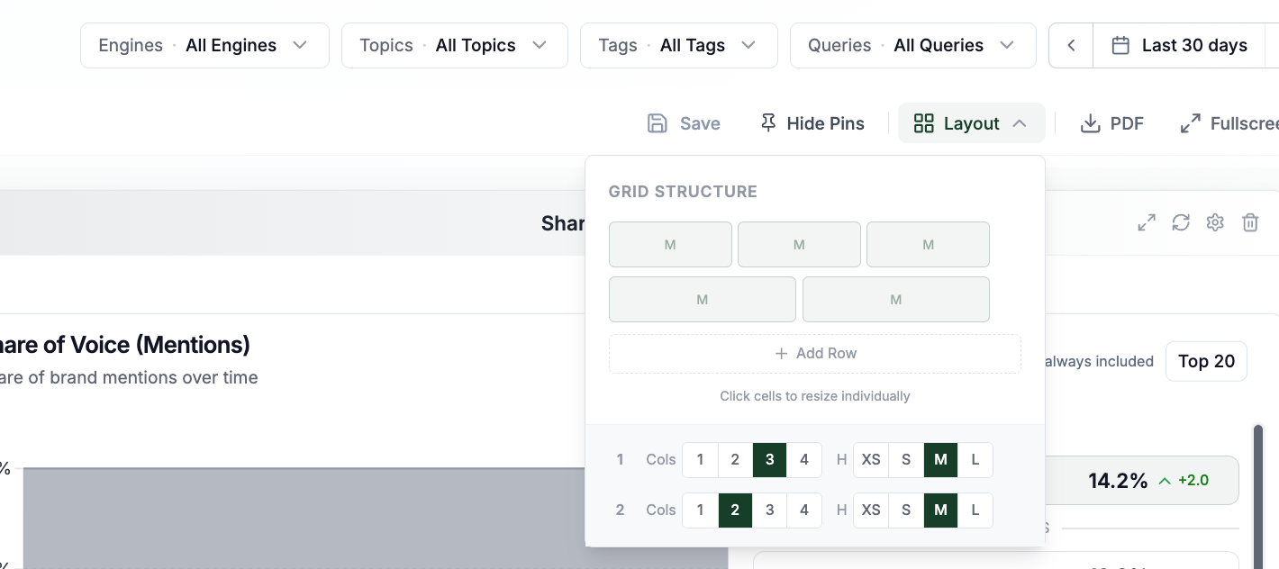
Tip: You can choose your grid structure in the layout configurator at the top.
Adding and Changing Widgets
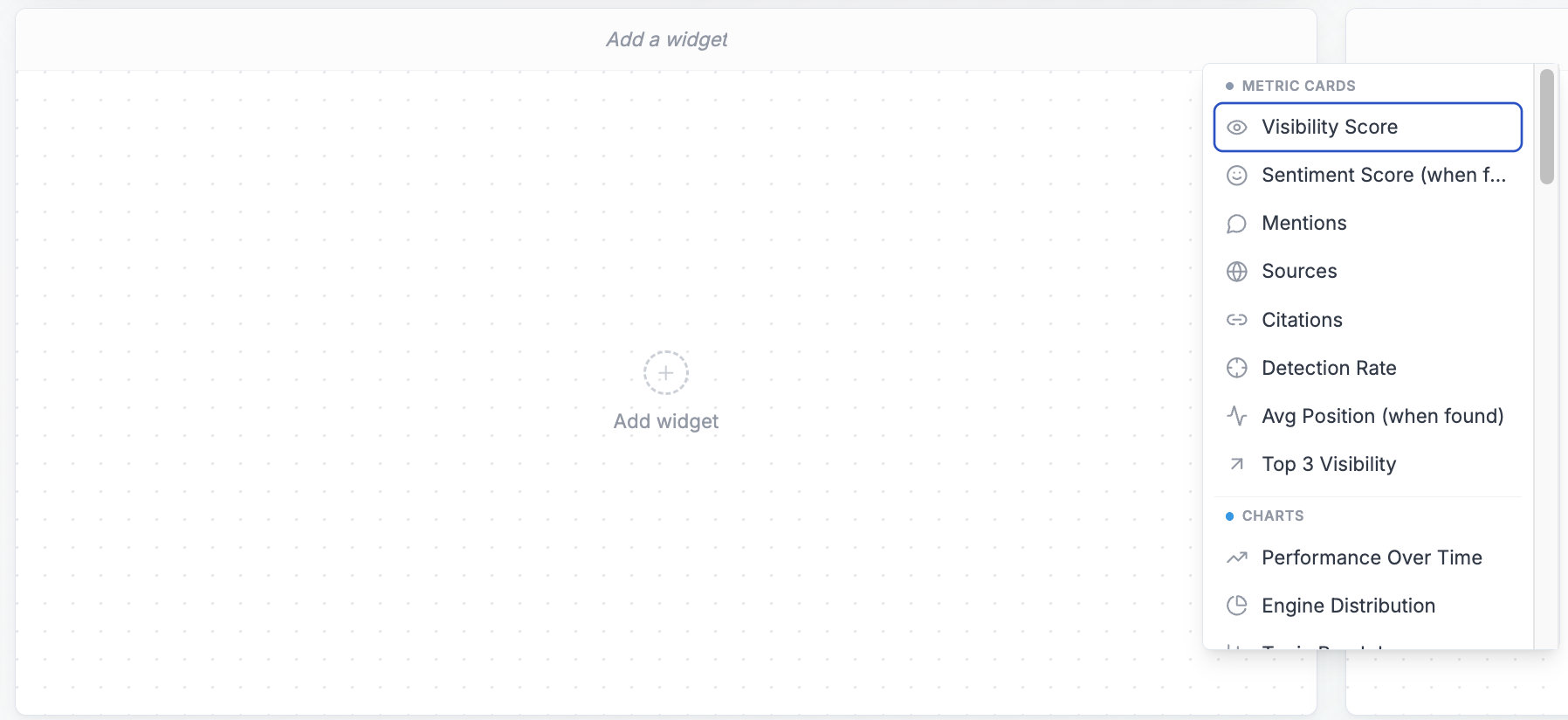
Hover over an empty cell and click Add widget.
Pick a widget from the picker. Widgets are grouped by purpose: Metric Cards, Charts, Competitive, Scoped, Citations, Sentiment, Shopping, Sources, Query Fanout and Editorial. What each widget shows is in 📄 Custom Dashboard Widgets and Filters, and what each metric means is in 📄 Metrics in Rankscale.
To swap the widget in a cell that already has one, hover the cell and click Change widget.
The cell keeps its position when you change the widget. Settings that do not apply to the new widget are cleared, so nothing carries over that no longer fits.
Adding a Cell
Use the Add cell strip at the bottom of the dashboard.
If the last row has fewer than four cells, the new cell joins that row. If the last row is already full, a new row is added below it.
Configuring a Cell
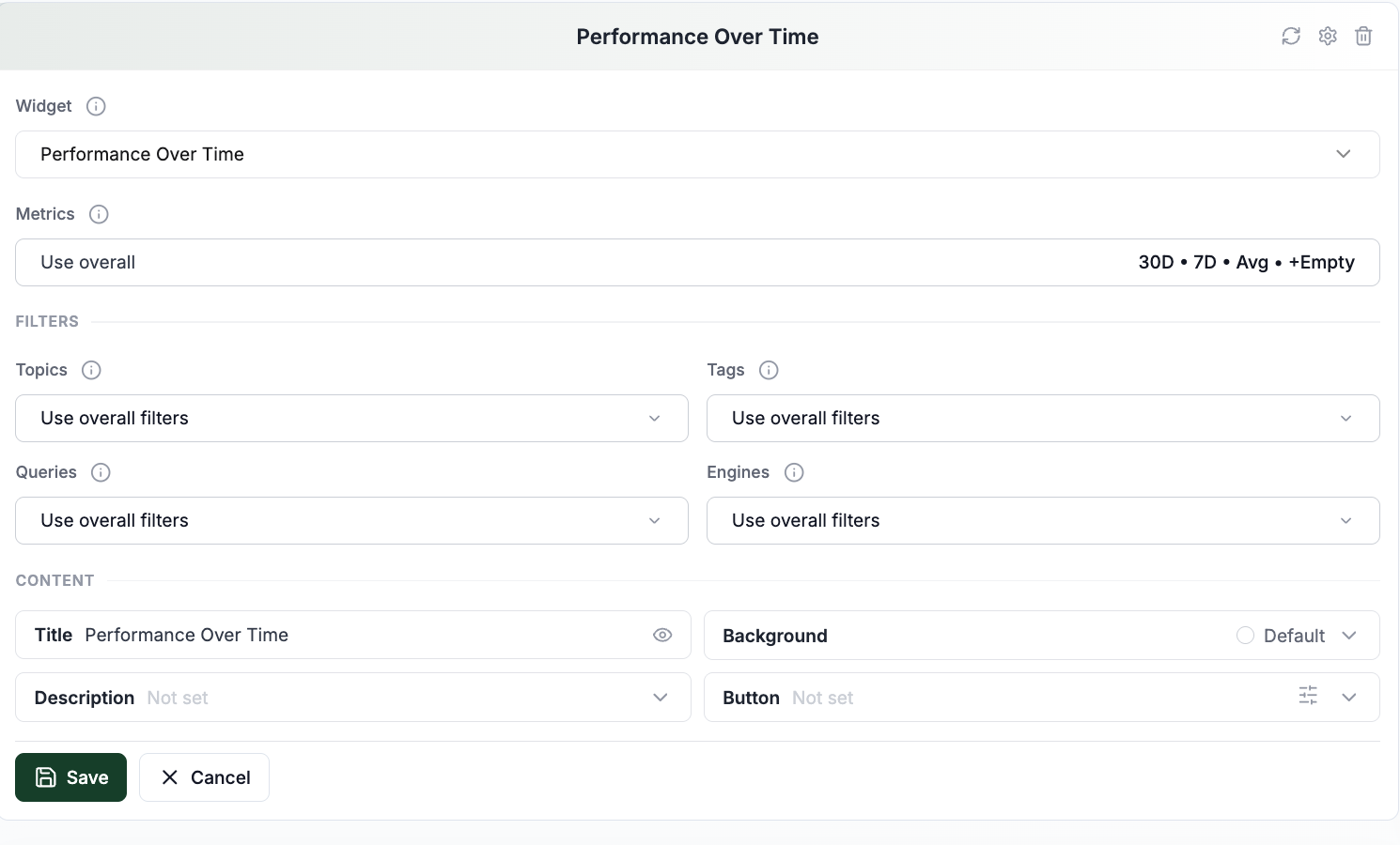
Hover over a cell and click the settings icon (Configure cell).
Change what you need in the panel:
Title visibility and title text
Description text and where it sits
Cell background color
Widget type
Widget-specific settings
Metrics and filter settings, on widgets that support them
Click Save in the panel.
The cell updates as soon as you save it.
Warning: Clicking Cancel or pressing Esc discards every edit you made in that panel. There is no undo.
Rearranging Cells
Drag a cell and drop it onto another cell to swap the two positions.
The full configuration travels with the widget: title, descriptions, filters, background color and widget-specific settings.
Clearing a Widget or Removing a Cell
These are two different actions, and which one you get depends on whether the cell has a widget in it.
To empty a cell but keep it in the layout, hover it and click the trash icon, then confirm Clear Widget. The content and its configuration go, the cell stays.
To take the cell out of the layout, clear it first, then click the trash icon on the now empty cell and confirm Remove Cell.
If you remove the only cell in a row, the row is removed with it.
Warning: Neither action can be undone.
Saving your View
Your layout is kept as you work, but it stays unnamed until you save it as a view. The view selector in the toolbar reads Unsaved View until then.
Click Save as new... in the toolbar.
Give the view a name that says what it is for, such as "Executive Overview" or "ChatGPT Citations".
Once a named view is loaded, the button reads Save and your changes are also saved on their own a moment after you finish editing. An amber dot next to the view name means there are changes still to be written, and leaving the page while it shows asks you to confirm first.
You can keep up to 25 saved views per brand.
Note: Automatic saving pauses while a cell configuration panel is open, so your uncommitted edits are never written to the view. Click Save in the panel to commit them.
To present, export or share a saved view, see 📄 Presenting and Sharing a Custom Dashboard.